Everything on this page can be added from the admin panel: place the cursor on an empty line in the Content (body) field and pick the component from the Embed menu. Each component’s fields are exactly the props documented here.
This page is the reference for editors. If a component is added to
mdx-components.tsx, add its template to tina/mdx-templates.ts as well —
otherwise Tina cannot open pages that use it.
When writing MDX by hand, always spell booleans out: arrow={true}, not the
shorthand arrow. The shorthand renders fine but TinaCMS cannot parse it, and
the page then opens as raw text in the editor. Tina itself always writes the
explicit form.
Callout
Five types, each with its own colour and icon. emoji overrides the icon.
Steps
Start every step with a heading; Nextra numbers them automatically.
Open the project
Choose File → Open and select the .spar file.
Place the model
Point the camera at the marker and wait for the outline to turn green.
Save the inspection
Press Ctrl + S.
Tabs
items holds the tab labels; the order must match the Tab blocks below it.
storageKey makes every tab group with the same key switch together and remembers
the choice in the browser.
SuPAR-Composer-Setup.exeCards
A link grid. icon takes a name from the Nextra icon set, arrow adds a “→”.
A single card outside a grid:
Keyboard shortcutsFileTree
- index.mdx
- _meta.ts
- next.config.mjs
Details
A collapsible section — useful for long tables or optional background.
Which file formats can be imported?
STEP, IGES, STL and OBJ. Large assemblies are converted in the background.
Open by default
Set Start expanded to show the content when the page loads.
Bleed
Widens content beyond the text column; full extends it to the page edges.
Button
A link styled as a button. Without a link it renders as a plain button.
Open the manual Nextra documentationImageZoom
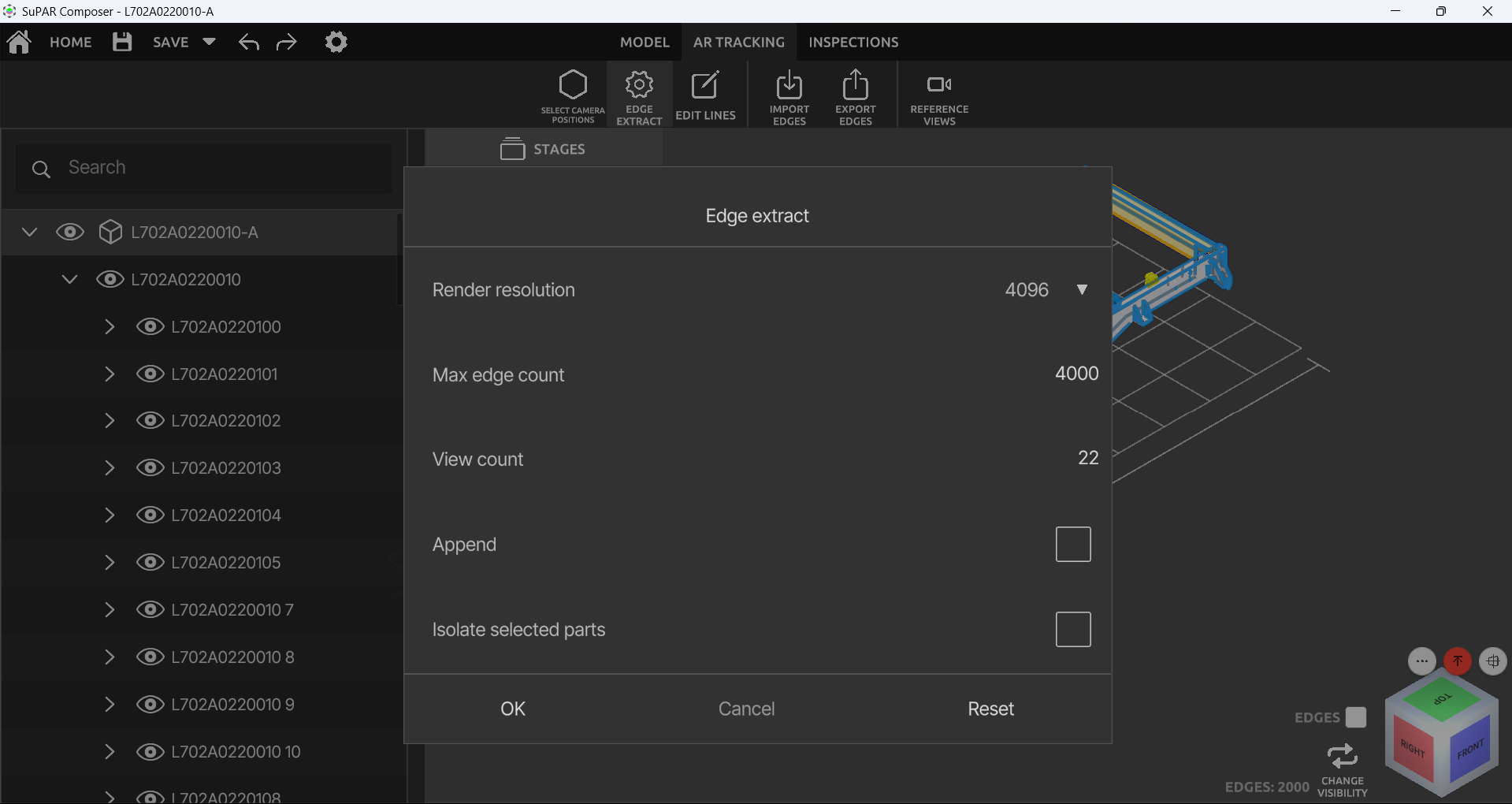
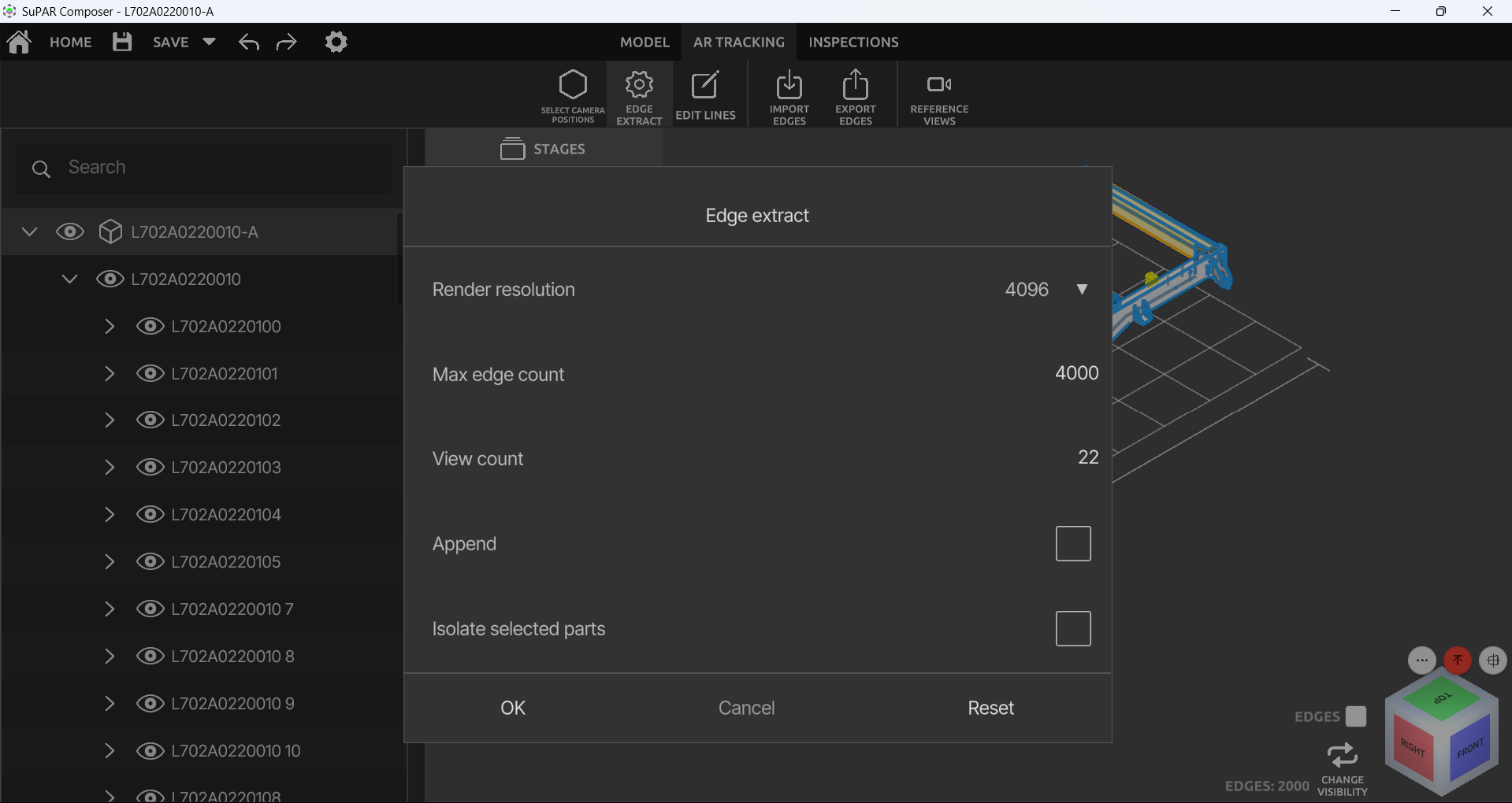
Click to enlarge. Width and height are the image’s real pixel size — required,
because the component is based on next/image.
Mermaid
Diagrams from text. A mermaid code block produces the same result.
Popup
Video
The project’s own player: subtitles, audio tracks and a transcript panel.
Markdown features
Code blocks get a copy button, a language label and an optional file name:
export function metaFor(lang: string, path: readonly string[] = []): MetaRecord {
  // ...
}
Tables, footnotes and task lists work as plain Markdown:
| Component | Editable from Tina | Nested content |
|---|---|---|
| Callout | yes | yes |
| Tabs | yes | yes |
| Mermaid | yes | no |
Native <details> also works without the Details component: